
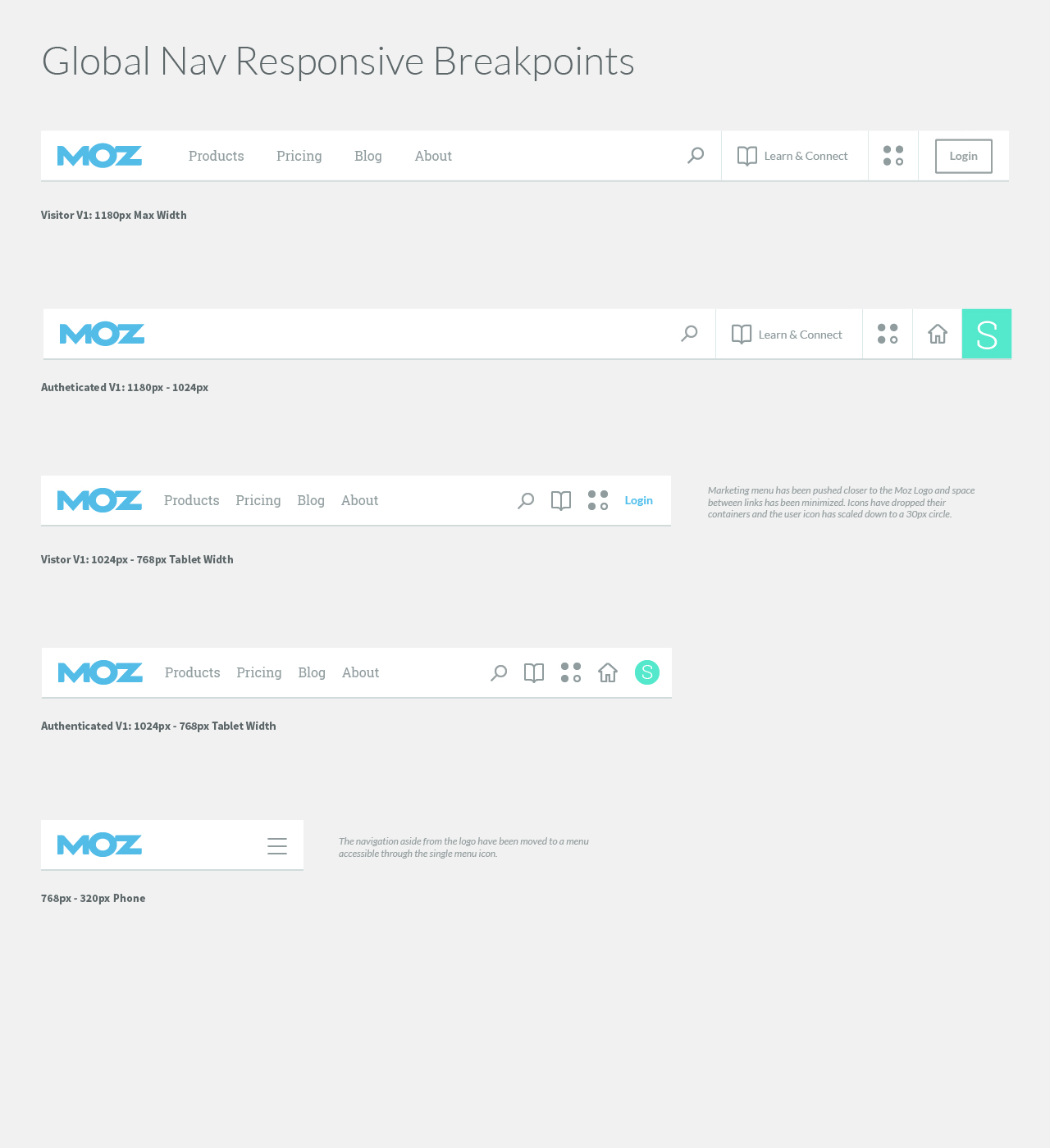
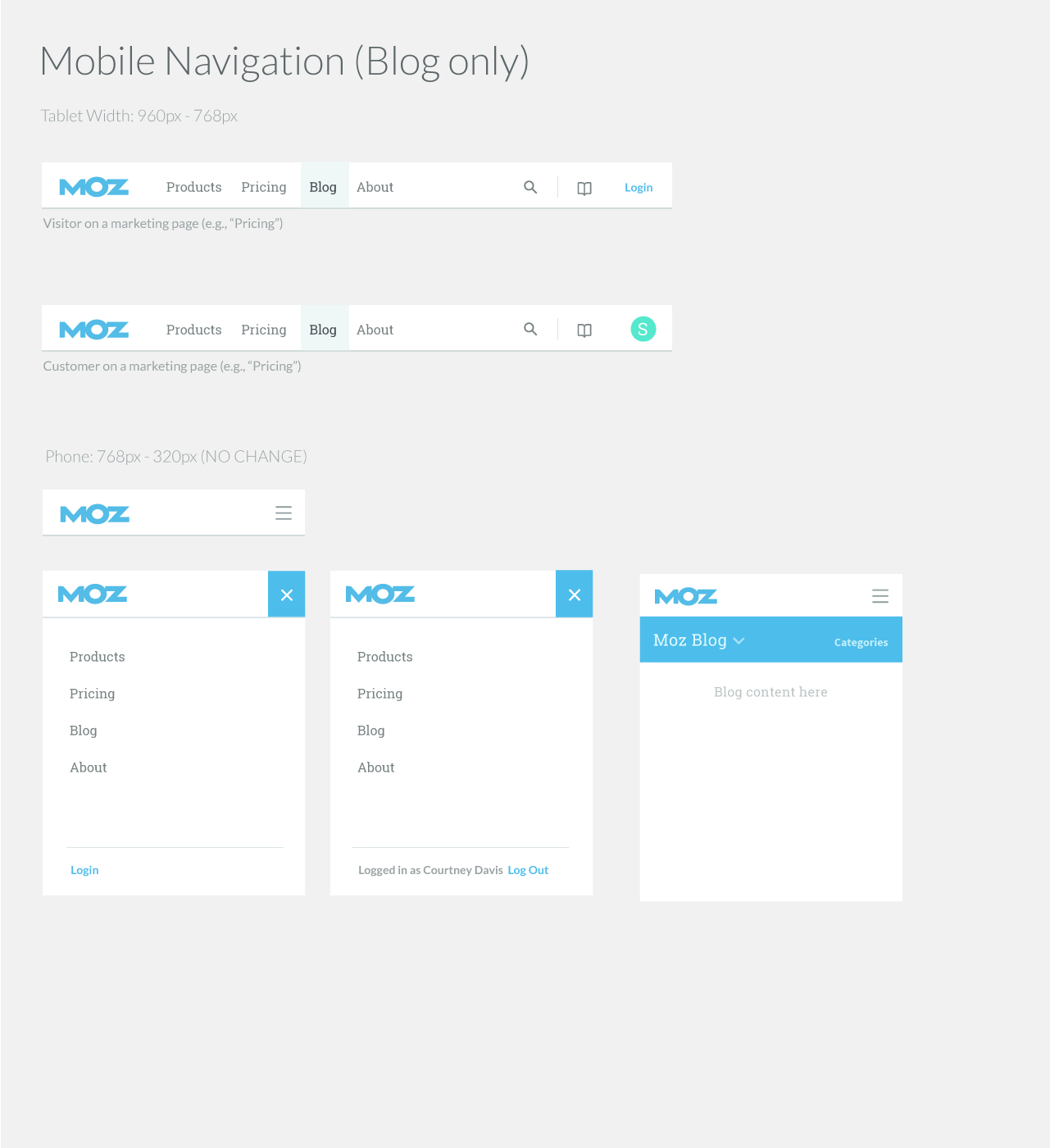
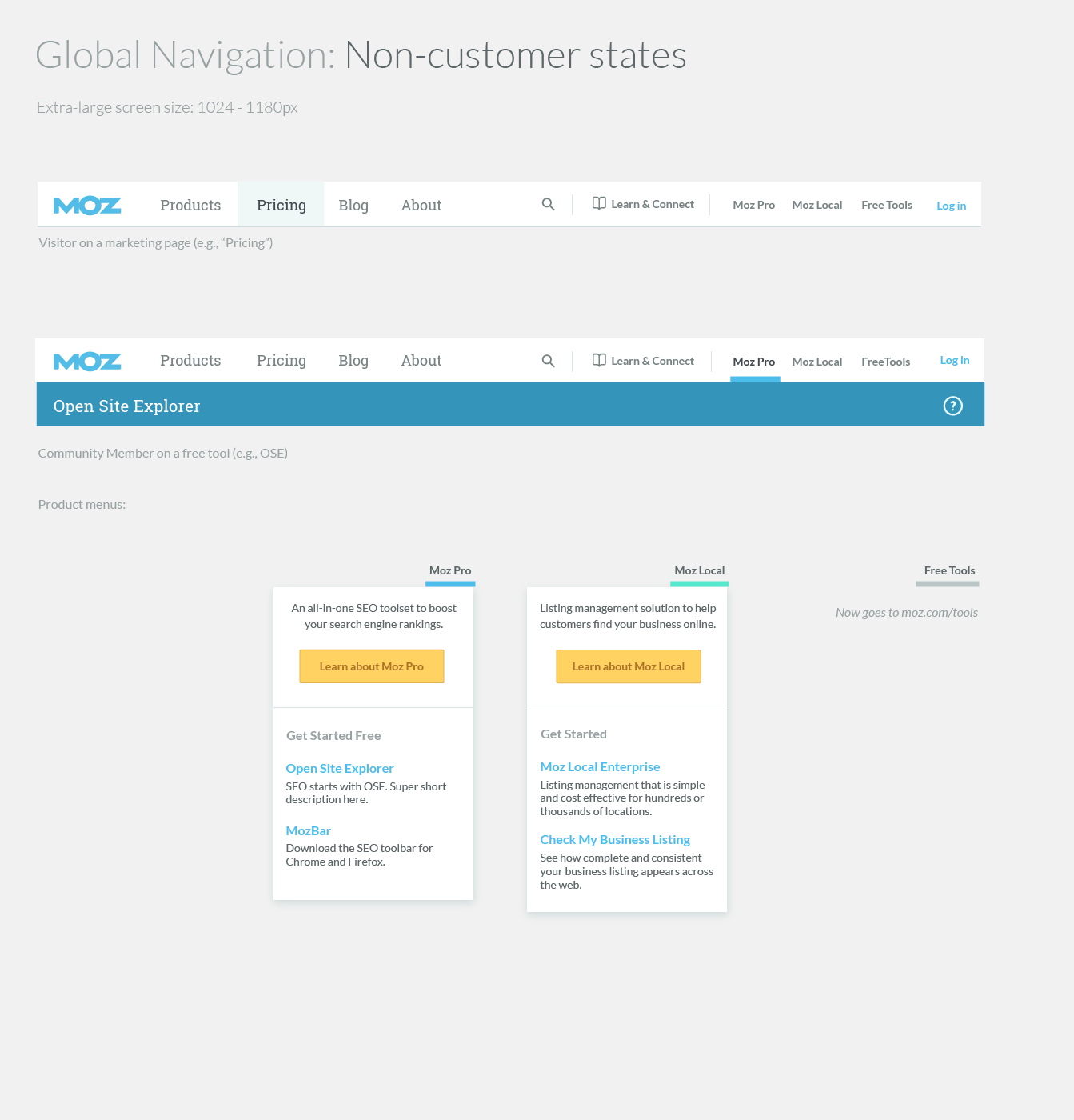
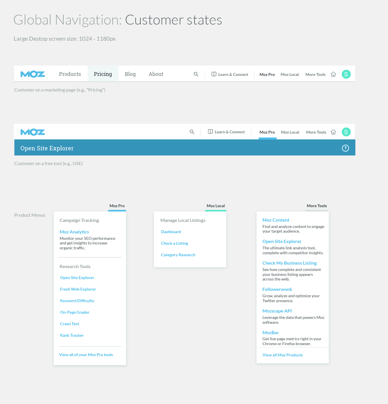
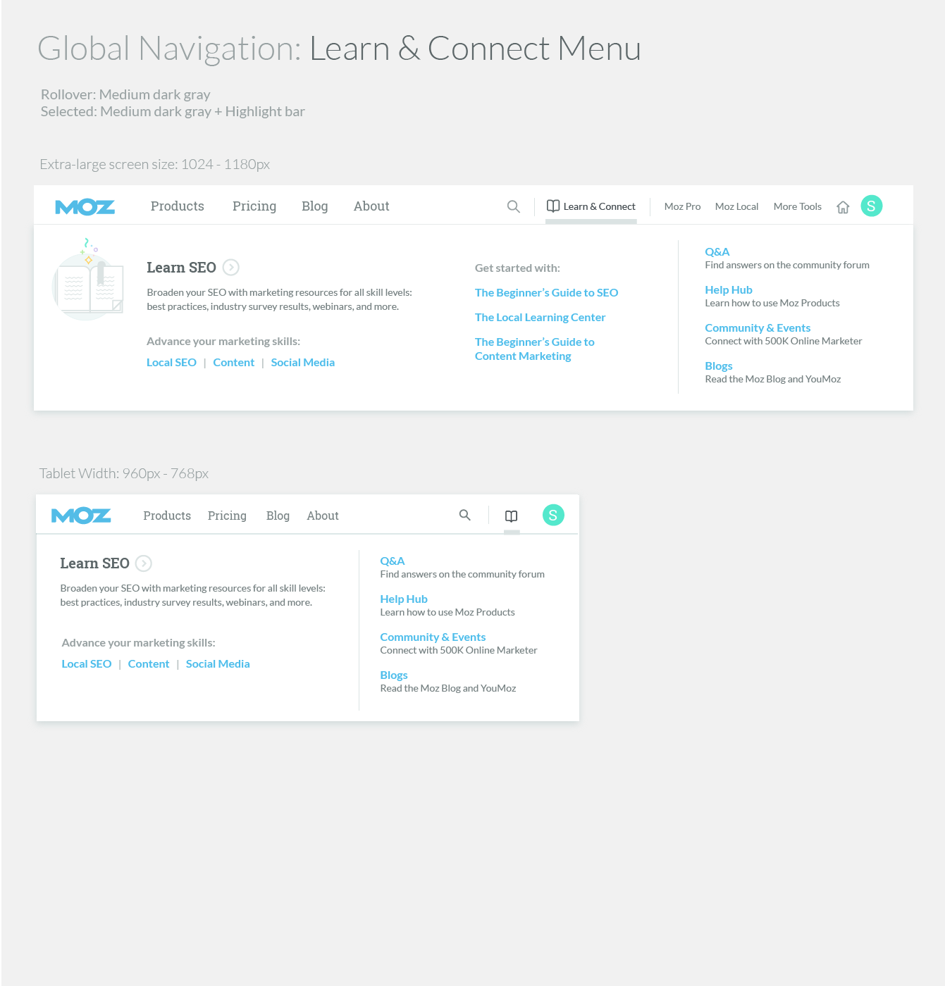
Global navigation
A lean, collaborative process to unify 13+ web properties.
In 2015, as Product Design Manager at Moz, our cross-disciplinary team launched an initiative to unify products, free tools, marketing, and community content to drive product usage and deepen customer engagement. While managing and mentoring three designers, I contributed alongside them, ensuring we balanced design work and collaboration with business owners. Together, we developed a more cohesive, flexible, and intuitive user experience across all platforms, significantly enhancing customer engagement.

As Moz grew, the experience fragmented.
Stop-gaps were made to enable way-finding, but we were quickly outgrowing our systems.
In the words of our CEO, the conclusion was “one nav to rule them all.” Through this effort, we made significant improvements not only to our navigation interfaces and information architecture, but massive improvements to supporting organizational and technical systems.
Phase 1: Leading an inclusive discovery phase
I co-led this effort with a Product Manager who focused on business goals, technical limitations, and prioritizing requirements, while I led the workstreams to understand user needs, audit content and current task flows, and draw inspiration from competitor and benchmark sites. To align internal stakeholders and ensure we had proper input and feedback, we designated a collaborative space in the office to display user stories, inspirational sites, business objectives, customer pain points, and current task flows. This environment facilitated discussions with over 35 stakeholders, fostering transparency and collective ownership of the project's direction. Ensuring our process was inclusive and iterative not only built buy-in along the way but also strengthened team trust and bonding, which enhanced collaboration and contributed to the project's success.
The foundational framework was based on:
customer pain points
business objectives
content inventory
user stories
current task flows
inspiration and benchmark sites

Prioritizing user stories
User stories formed on a wall in a common space, inviting business owners to review, refine and share ownership of what was critical to connect through global navigation. Every story below the line were to be solved with local navigation at the application or page level. Everything about the line was a considered a primary user story for global navigation.
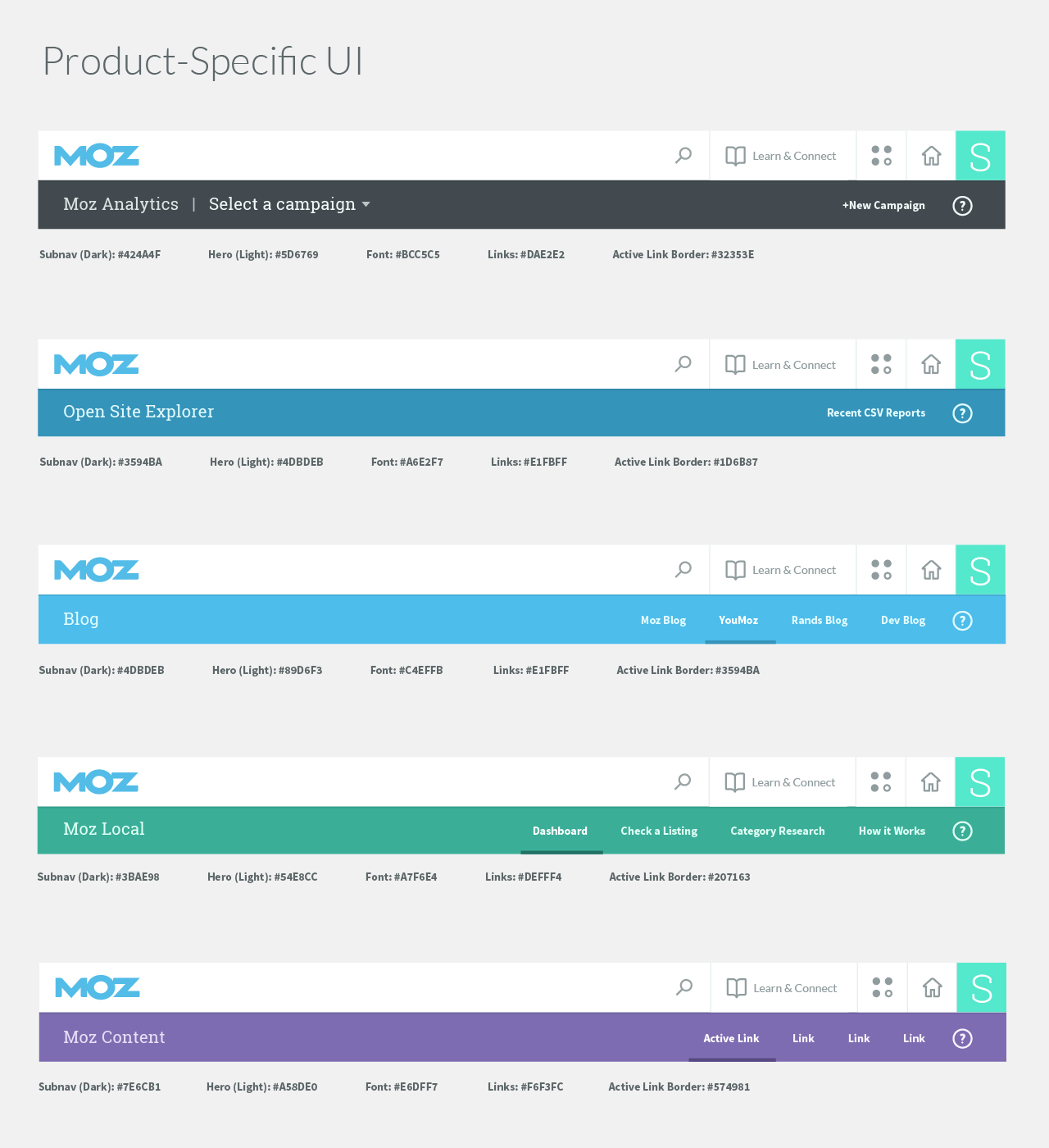
Auditing the current experiences
This visual content inventory illustrated our inconsistencies and served as a high-level map of the ecosystem we had to consider.
Tracking current task flows
The team worked together to document current task flows, walking through steps needed to complete key scenarios. These task flows were used by the Business Intelligence team for tagging and tracking to establish solid benchmark metrics.
Evaluating core scenarios
Our User Researcher conducted usability tests on the current site to understand where customer pain points were in the existing task flows.
We researched competitors and industry examples to see how other sites solved similar problems.
Phase 2: Informing a user-centric site strategy
During the definition phase, we discovered competing perspectives on how to integrate products with free tools, and marketing content with community content. To address this, I facilitated collaborative sessions that elicited critical questions and considerations for each concept. This opened discussions and informed a unified UX strategy that balanced business objectives with an optimal user experience.
Our user researcher played a crucial role in driving formative and evaluative research to inform a user-centered solution. Through card sorting and tree testing, they gathered insights directly from users, ensuring the navigation aligned with their mental models and was intuitive.
These combined efforts resulted in a streamlined architecture that reduced friction and improved content discoverability. By embracing a human-centric process and valuing individual contributions, we secured stakeholder buy-in for a scalable framework adaptable to future growth.*
The information architecture phase consisted of:
remote card sort
tree testing x3
internal interviews
concepting workshop
conceptual architecture
guiding principles
site maps
Understanding user mental models
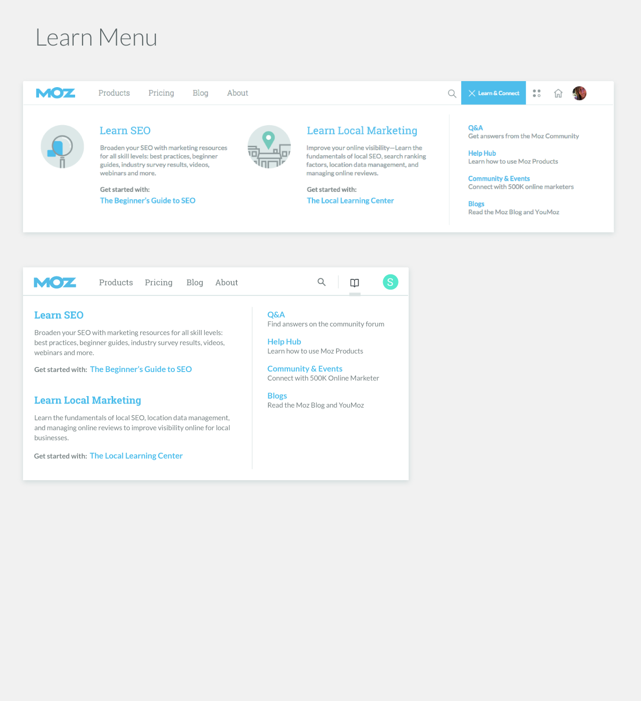
Our User Experience Researcher conducted a card sorting exercise with OptimalSort to identify user preferences and mental models. The insights and analysis, depicted in these images, shaped our user-centered taxonomy.


Exploring concepts with key stakeholders
I conducted stakeholder interviews with leadership across product, marketing, and engineering to understand their perspectives and expectations. Leveraging these insights, I led collaborative feedback sessions to develop and refine navigation concepts. During these sessions, we systematically evaluated each concept by posing critical questions that invited diverse viewpoints and addressed key decision points. This inclusive approach fostered a shared understanding of differing perspectives, inspired innovative ideas, and facilitated constructive discussions around trade-offs.
View the deck used to facilitate the workshop.
View the workshop outcomes summarizing key take-aways
Establishing a new organizational model
After establishing our taxonomy, we conducted three rounds of Tree Testing using TreeJack to validate and refine our information architecture (IA).
Current IA (Benchmark): We evaluated how effectively participants could complete primary tasks within the existing architecture to establish a performance baseline.
Proposed IA: We introduced a new architecture and observed participants as they attempted the same tasks. This provided critical feedback on our initial design assumptions.
Refined IA: Based on the feedback, we made minor adjustments and tested the refined architecture with a third group of participants to ensure improvements.
This iterative research approach was both cost-effective and efficient, providing us with robust data to guide our design decisions. By involving users in each testing phase, we ensured that our IA was intuitive and user-centered. Additionally, the clear, evidence-based insights gained during this process reassured stakeholders, fostering trust and buy-in for our unified UX strategy.

Proposing a new UX architecture & design principles
Every part of the process informed a conceptual model for the new organization system and guiding principles for design consideration.
View the design principles used for executive feedback before moving forward in finalizing the detailed site maps.
Site maps were informed by project objectives, customer pain points, multiple rounds of research, internal interviews, and an approved experience strategy.


Phase 3: Interaction Design, Prototypes & Iteration
We pulled together a cross-functional design team to take this project to the next phase: Interaction design. We worked in design sprints, testing a prototype at the end of each week and posting our ideation and insights for company-wide feedback and observation. We did this for 3 weeks, meeting a couple hours a week.
The interaction design phase included:
cross-functional team sketching
design sprints
prototype testing each week (x3)
company-wide feedback opportunities
Empowering designers to explore solutions
We worked through interface and interaction design concepts and tested hypothesis by walking through task flows for primary user stories. This also helped to ensure we had quick but solid test plans for rapid rounds of user research.


Eliciting feedback from key stakeholders
Ideas and observations were posted on the wall for all to see. Some stakeholders needed a little 1:1 attention, so I would walk them over to the work and ensured their perspectives were heard and captured.
Prototyping potential solutions
I practiced using different prototyping tools, starting with clickable PDFs and moving on to Justinmind Prototyper for more detailed usability studies as our ideas progressed.
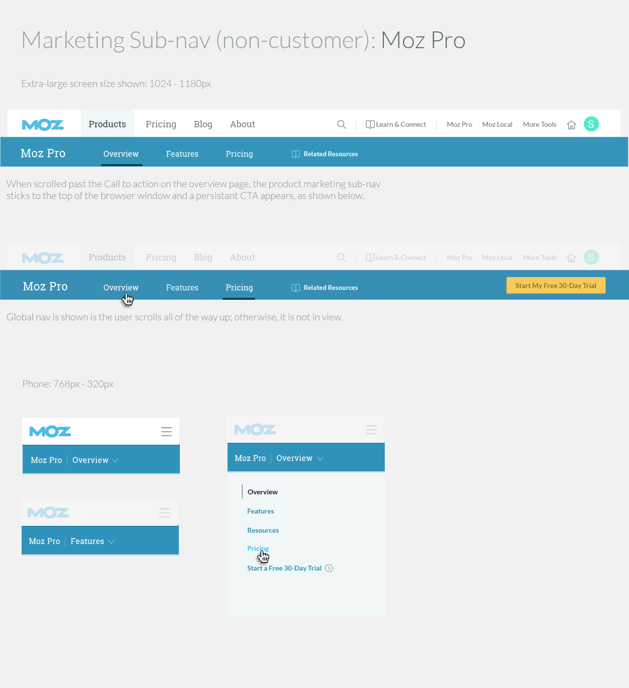
Phase 4: Execute on design & development
Once an interaction design concept was solid, we moved onto the visual design phase. Several of my teammates had recently completed some brand research and were working to establish a UI Pattern Library. The navigation UI was a great place for the team to try visual design concepts in context.
The visual design phase wrapped up with:
High-fidelity UI design exploration
HTML prototype
URL Mapping
Final executive approvals
Engineering hand-off
We put together an HTML which helped to:
communicate and finalize UI details
ensured a strong, relatively painless engineering handoff
collect feedback in a robust usability test
This HTML prototype was created by my teammate, Ben Simpson.
We tracked URL mappings, site updates, scope and progress in a spreadsheet and Jira.
After one last round of usability testing on the high-fidelity prototype and a few small tweaks, we closed the books on the v1 design phase.
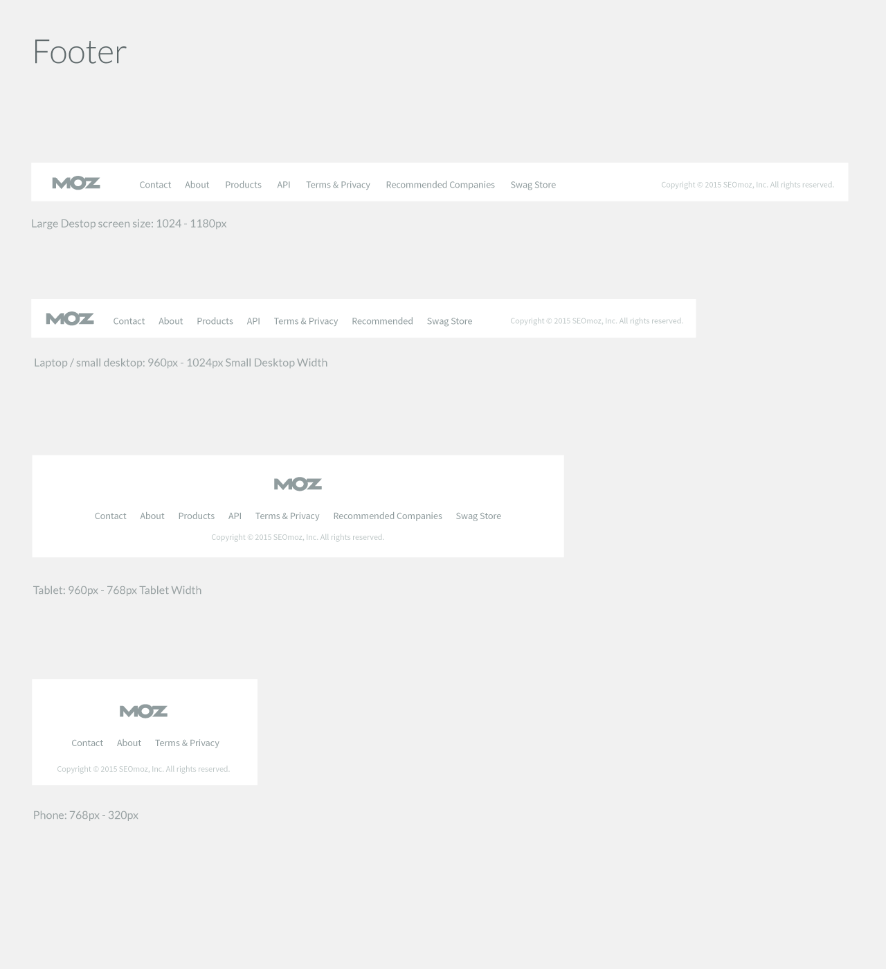
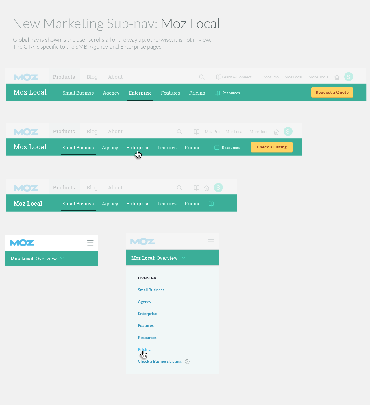
The final design system unified 13+ web properties with a cohesive visual system.
Post Launch
One of our primary products saw a significant drop in traffic:
% of visitors getting to the product’s home page dropped nearly 2%
Organic leads remained the same percentage of the overall traffic, and dropped 8%


We saw a 40% drop in visits to this product, Moz Local from the homepage, expecting that the negative impact on leads was due to moving "Moz Local" under a "Products" menu. While this design decision was consistent with the company vision, the impact on aquisition was unacceptable.
Iteration
We launched an update that solved the immediate problem as quickly and directly as possible: Show a link to Moz Local front and center on every page. The updated resulted in the following success metrics:
Local Homepage: +8% (99% significance)
Local Check Listings: +39% (99% significance)
Local Enterprise Page: +71% (99% significance)

We launched. We learned. We iterated.
Since launching this global navigation, I monitor pathing and usage date for global navigation weekly in Adobe Analytics. We're currently working on a significant navigation updates to align with a new SEO-focused strategy. The launch plan this time around is conservative as we cautiously test an iterative rollout.