
Research simplified
A guided experience to simplify a sophisticated research technique.
One of my first assignments after joining Qualtrics in May 2017 was to help launch the initial product offerings for the emerging Product Experience Management line of business. Over the summer, I collaborated closely with a small engineering team, driving the design process to simplify advanced research into a streamlined 4-step experience. This foundational work not only set the stage for future Qualtrics Solutions but also demonstrated the value of user-centered design in shaping new product directions.

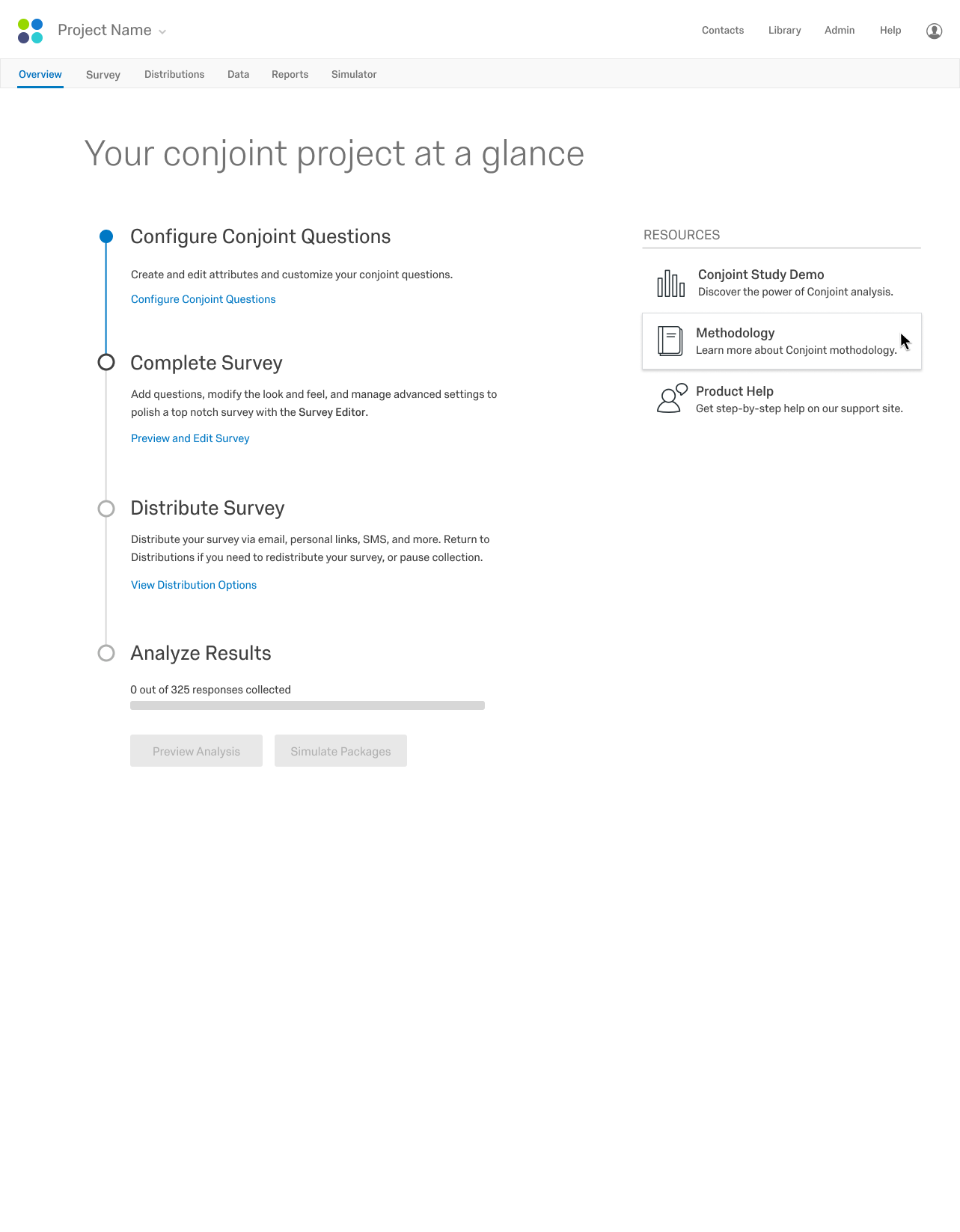
Conjoint is a research method used to optimize products and pricing. Even with our custom tool, the experience was cumbersome, time consuming, and expensive.

We simplified the experience to bring the power of Conjoint to the masses with a guided flow, pre-built reports, and outcomes simulator.

Phase 1: discovery
Even though Qualtrics had an existing application for Conjoint survey design, there were a lot of unknowns. The design phase started before a product manager was hired, so I relied on our subject matter expert and engineers to understand the potential scope and limitations. I leaned heavily on other designers and product managers to gain enough knowledge about existing UX patterns and aspirational ideas about the platform before I felt I could form any meaningful design decisions.
learn the problem space
understand the technology
leverage parallel efforts
consider how it all connects

existing application
I met with our subject matter expert to understand the current process and the internal application he had built.

understanding the platform
I spent a couple days really digging into the existing platform architecture and technology to better inform a realistic solution for integrating conjoint into the experience.

northstar explorations
The idea of simplifying complex research and analysis had been initiated and incubated by others before I got the chance to bring the ideas to life through Conjoint. An important step in the UX process was to learn from earlier visionary explorations and leverage UX and UI patterns where it made sense.
Ryan Sun and Jerrod Larson did the heavy lifting on UI and UX concepts for this guided flow through their northstar work.
I captured my understanding of how this Conjoint solution fits within the bigger picture for this emerging product line.
This impromptu artifact helped the product team discuss business potential and road map opportunities both internally and externally long after Conjoint launched.
Phase 2: design
Most of the design concepts were explored and refined with lower fidelity flows and wireframes to define a minimum viable product (MVP). Improving the visual design system was certainly a hot topic, but the ~10 person UX team lacked the resources and support to invest in a more robust design system. Major visual changes were well beyond the scope of this project. Instead, I focused on establishing UX patterns that could easily be skinned and scaled, careful not to introduce anything that competed with the existing interface.
Wire flows
Sitemaps
Wireframes
Design comps

wire flows for key scenarios
I drafted mini wireframes across the tasks flows for key scenarios to start with a holistic view of the problem space and potential solutions. I learned in discovery that integrating this experience into the existing platform would take some coordination, and I wanted to make sure everyone was on the same page.


site structure
I often include a site map in early UX discussions to ensure everyone is aligned on how the feature fits into existing infrastructures. It was particularly important for this project, since our team relied on platform teams to properly integrate and ensure optimal UX out the gate. The blue boxes here were the pages our team was building within the context of other platform experiences.

wireframes
Detailed wireframes quickly followed. Simplifying the critical steps to setup a conjoint study was key to get right first. Most of the wireframe iterations were around the setup experience, with a bit of thought around resenting the analysis and simulator experiences after data was collected.

high-fidelity design
As the concepts refined to higher and higher fidelity, I pushed for stronger product integration with the survey editor. It was not ideal for conjoint aspects of the survey to be configured in one place, and general survey questions in another. We had to do better to connect the experiences and I pushed for various ways to achieve this. Ultimately, any integration with the editor was very expensive, so we needed to verify with users if this was truly a deal breaker for MVP.
Rounds of revision later, we were ready to evaluate the product concept and design ideas with prospective customers.
Phase 3: validation & iteration
Since this was a brand new product and the first Qualtrics experience with a fully guided setup flow, it was critical to get early signal from prospective customers. We needed to ensure we were heading in the right direction before heavy engineering investment. Through this phase, we identified easy wins to improve the initial experience, and started a long list of future investment opportunities. With a validated and refined product concept, we could move into UX production and engineering hand-off.
design prototype
user feedback
design refinements
UX delivery doc

design prototype
I put together an InVision prototype to quickly test our hypothesis, uncover opportunities for improvement, and inform roadmap additions down the road.

research findings
My colleague, Marc Todd, evaluated the design concept and determined successful in support of an MVP launch (this image is an artifact from his report). He identified a couple usability issues that we could improve with copy or UI changes, and noted several key opportunities for future releases.

ux delivery doc
I put together a UX doc to finalize copy and alternate states as a part of the eng hand off, since we had yet to hire any UX writers and the team’s product manager was just ramping up. This Google Doc worked well enough to coordinate between teams and ensure important experience details were polished before launch.
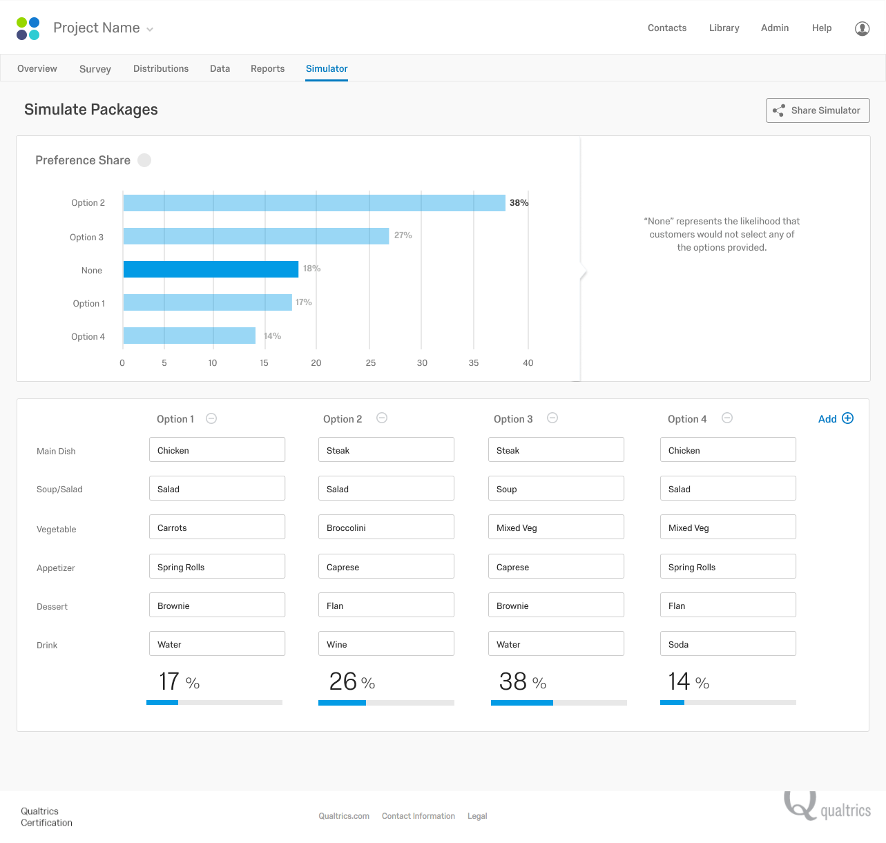
Final design comps visualized key scenarios from setup to simulator.


Outcomes
The guided experience designed for Conjoint established a UX framework that scaled naturally. Qualtrics promoted Conjoint made easy at x4’18, and introduced a line of ready-made solutions to follow suit. By 2020, there was a dedicated product and UX team to improve and build on these bones.
View the latest on the Qualtrics Marketplace.